Give stakeholders what they want: more charts

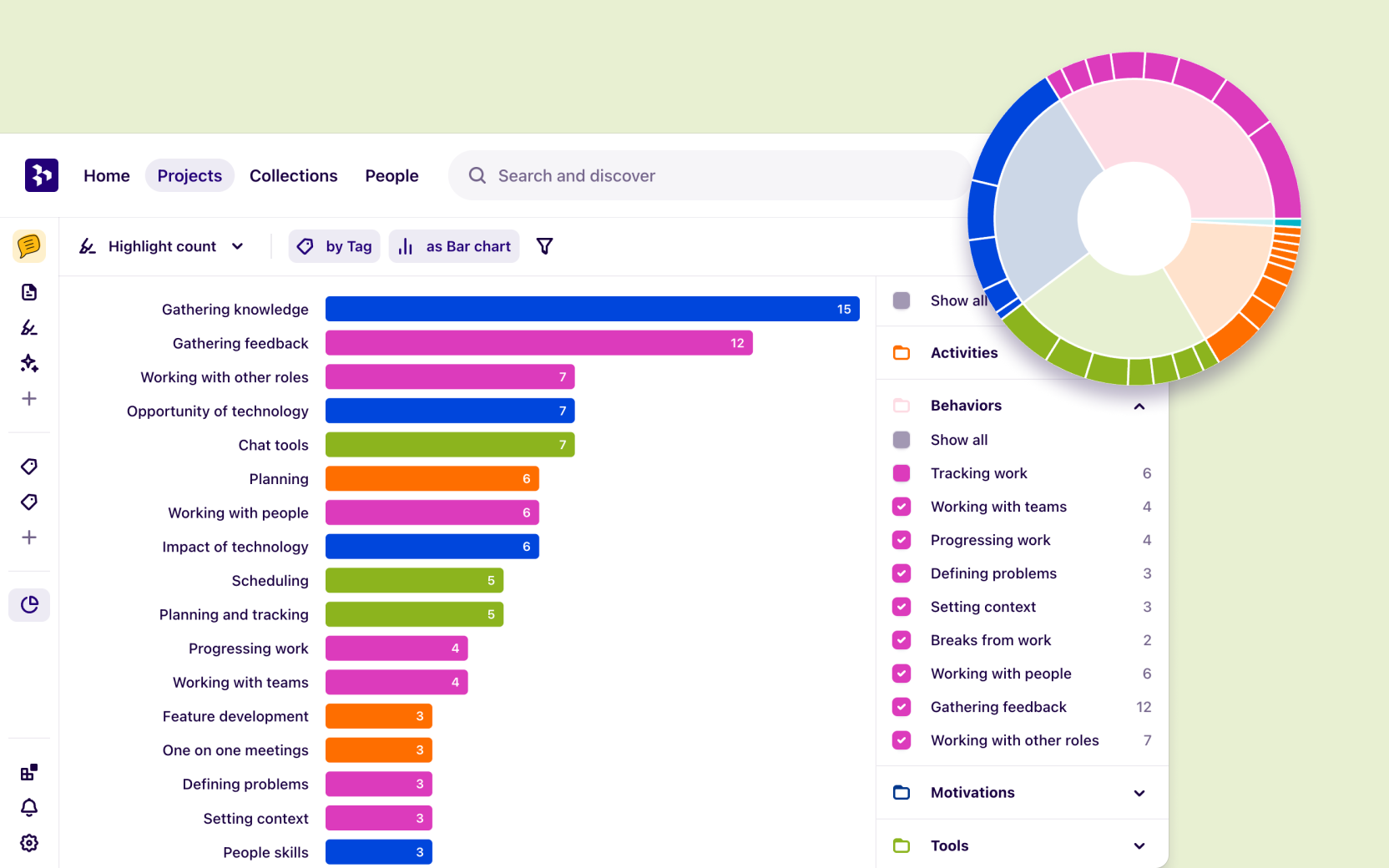
Impressing stakeholders just got that much easier with the ability to filter charts in Dovetail. Now you can slice and dice your data to track trends across personas, usability scores, company size, interview quotes, anything!
Filter your data by field, note, insight, and creator. Add them one at a time or all at once to create charts sure to delight even the most stubborn of stakeholders.

Change up your charts
Stakeholders coming back for more? Try out more ways to visualize your charges with four ways to see your data from different points of view:
Use the Bar chart to simply compare relative data in horizontal lines.
Create a pie chart to visualize different slices of your data.
Try out a radar plot to easily spot outliers.
Make a treemap for a colorful and quick way to take in your data.
Set your chart free
You've sliced and diced it; now it's time to see your chart free. Attach it to presentations or insights to give your stakeholders reports worth coming back for.
For more information on charts, check out our help article or join the conversation in our Slack community.
A whole new way to understand your customer is here
Log in or sign up
Get started for free
or
By clicking “Continue with Google / Email” you agree to our User Terms of Service and Privacy Policy


